Power User Badge: UNIX

Standard

This was a fairly simple badge to accomplish. I was extremely surprised to find that it took under two hours to download Ubuntu 12 on my old Macbook. Once downloaded, I couldn’t believe how much faster my computer was to use! I realized after I Wikipedia’d it that because it has open source software, people are always improving it (that’s why there’s Ubuntu 12). I am actually pretty sure that this version came out less than 10 days ago!

I installed Ubuntu on my old laptop using standard installation with a graphical install by burning the LiveCD to a CD and then booting it, running the CD from “My Computer.” I installed random games such as Blocks of the Undead (spooky tetris) and Skills Motocross. I also installed Filezilla on my system.

Stylistically speaking, I LOVED the way Ubuntu looks. I guess it was just so much cleaner than I am used to. It will probably take a little getting used to, but I can see myself going back on my old laptop to use it a lot. Even though I don’t have much experience with Linux, I wouldn’t be afraid to use it on a daily basis.

For some reason the sidebar intrigued me—I thought it was very stylish and sleek. I mostly wondered why Linux never became as popular as iOS or Windows OS, because I don’t see what could be wrong with free, open source software. I never really ran into any major problems during installation—no error windows or crashing. All in all, I’m glad I went through and took the time to install Linux. I think it will be a useful thing to have in the future.

Coding: HTML Wired Forms Badge

Standard

Here’s a link to my survey about Portlandia!

This was mildly painless to create after watching both of the video tutorials on Lynda. These both taught me about the different styles of widgets–submit button, check box, radio button, text widget–and gave in-depth instructions of exactly how to create HTML for wired forms. As far as the tutorials went, I think I respond best to visual teaching methods, especially when learning to code because I have to know exactly where something goes in. I’d say the most difficult part about this was simply getting the values right for the buttons, because I had a few typos at first when I started sending the form responses to myself. I made the survey themed around my Capstone project, which asks a random selection of individuals about their responses to the IFC show, “Portlandia.” The questions in the survey are very similar to some of the questions I asked in the in-depth interviews I conducted for my final project.

HTML Intermediate

Standard

This assignment was extremely easy compared to the stuff we’ve already done. It seemed pretty repetitive. This is probably largely due to the fact that I should have completed this assignment by February. Anyway, it took me about 3 or 4 hours to complete, the majority of my time going to choosing which blogs and articles I wanted to use and styling the site. As a poor photoshopper, I did spend some time fixing the navigation bar. I didn’t use many outside resources aside from Googling small things about CSS/HTML that had slipped my mind. I didn’t really encounter many large obstacles along the way, but my biggest problem is ALWAYS fixing the sizing proportions and widths in CSS. For some reason I somehow always find away to dig myself into a hole with that–but all in all, a quite simple assignment for the class. I enjoyed completing it, largely because there was no JavaScript involved!

Here’s a link to my site!

Completed Entrepreneurship Badge: Domain Configuration

Standard

Image

            For me, this badge was more difficult to accomplish than it looked. I probably spent a few days or so just researching different hosting services. I browsed a bunch of sites that ranked services, and I found that Namecheap appeared to be pretty much one of the highest ranked. I know that a few other people chose HostGator, which I found out was much less complicated to utilize in the end, but eventually I figured out what I was doing. It just took a lot of Googling and searching around on the site.

            I believe the domain itself cost $10.87/year, and the web hosting plan $47.40/year. This seemed relatively cheap compared to others. I spent about a week being confused about how to actually get my pages to connect to madelinerau.com. I finally figured out that I could use Cyberduck/Filezilla to do so, I just had to use the web hosting IP address and username/password sent to me via email from Namecheap. I thought that the web hosting site would be connected to Namecheap since I bought it from there, but it was called “cPanel X” and was like a completely different site that connected through.

            All in all, Namecheap’s control panel is IMPOSSIBLE. I did the majority of my configuring through  cPanel X once I got the hosting services. I had basically no idea what I was doing and I didn’t want to mess up something and then have no idea how to return to its previous state. However, the online tutorials for both sites did help a TON. It really simplified things for me and even showed how to upload my work in Bluefish into Cyberduck and Filezilla. Luckily, I found a particularly in-depth tutorial that explained I had to title the main html page “index.html.” I am very glad that this was made clear to me early on.

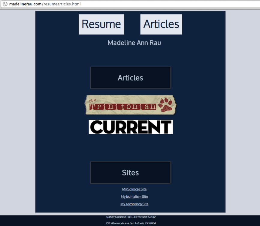
            Once I got to the point where I could see that my work was showing up on madelinerau.com, I felt much better about the badge. I would say I worked on my website a total of 5 hours, putting together my resume and relevant work/articles. I will definitely continue to work on this in the near future as I look for jobs, because I’d like to be able to show this and be proud of the way I’m representing my site and myself. This badge, for me, is probably the one I find most useful towards my future, and I’m glad I now have my own domain name.

Here’s a link to my website!

Graphic Design Badge: Logo Maker

Standard


PDF of my Memo

I chose Wikipedia as my client because I personally find their logo very outdated. Especially because everyone already knows what Wikipedia is, I think it could really benefit from a more aesthetically pleasing and representative logo that really shows what Wikipedia is all about. I believe my logo symbolizes and highlights the values of Wikipedia in creative and unique way.

Because I could not get Photoshop or Illustrator on my computer (the Adobe download site is down), I had to use Inkscape, but it had practically all the same tools available. I had a lot of fun making the logo. I also did benefit a great amount from the reading and video. All in all, I think I created a logo that really does Wikipedia justice as an open source of knowledge for millions of people on the Internet.

Industry Analysis Badge: Technology Cartography

Standard

PDF of my Cartography Badge

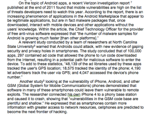
My technology of choice was smart phones. However, I chose to focus on Android because I wanted the analysis to have some focus to its form, as there is so much information out there to synthesize about “smart phones” in general. This was an organizational decision on my part, so the paper would have a unifying idea running through it.  I thought that in doing this, I could research the spectrum of all things Android, including both the new defining features along with the vulnerabilities. I also wanted to make some comparisons to other operating systems and make the reader aware that some of the concerns for Android phones are not specific just to Android–they can be equally troublesome for other smart phones. I spoke to an audience that might be considering purchasing a new smart phone, an audience that might not be completely tech-savvy in their nature.


User Experience Badge: Heuristic Analysis

Standard

PDF of my Checklist & Applied Analysis

I started out gathering information my searching about heuristics, interaction design, and web usability guidelines. One thing I felt was necessary was to organize the checklist in a straightforward way. I thought separating it by design/usability & efficiency/user assistance made sense, because although all three are connected, I felt I was able to find a place to put each bullet that made sense in that category.

The sources that I found the most useful were Jakob Nielsen’s “Ten Usability Heuristics” and Theresa Neil’s “Designing Web Interfaces: Principles and Patterns for Rich Interaction.” Neil actually built her post off of Nielsen’s findings, and did a really great job explaining what each section meant visually when navigating through a website. I chose to analyse 3 similar music sites because I have an interest in music and I thought that it could put an interesting spin on the assignment.

Minisite #2: Journalism & the Internet

Standard

As far as difficulty, this Minisite was DIFFICULT for me. I found myself spending massive amounts of time on the most mundane aspects of it–defining the color in CSS, fixing random pixels of padding and margins for text/objects, etc. The most annoying and time consuming part took place when I realized I hadn’t set the width to 960 pixels after I was almost finished (YES, that happened). I almost cried. Overall I’d say I spent about about 15 hours on it. However, it was definitely a learning lesson, and I sure won’t make that mistake again. I wanted to make the site simple, so I went with white as the background color–I hope it’s not TOO simple. In the end, I’m proud of my Minisite and I definitely feel like I’ve grasped HTML and CSS a whole lot more as a result of this assignment. Also, I did change up my format a bit after I did the mockups, the main thing different being the location of the pull quote.

Visit my site about Journalism & the Internet HERE!

Journalism & the Internet Minisite

Mockup for Article Template

Mockup for Analysis Template

Intermediate CSS Homework Assignment

Standard

When I first looked at this assignment, I knew it was going to take a little bit of time to figure out the kinks. And it definitely did. I think the things that gave me the most trouble were the margins and the padding. If I went over a certain number of pixels or percentage, the second column would disappear. It also took a while to figure out how to separate the pieces into divs, yet still keep one solid background. I also designed the border &  style around the image of the alien in the html inside the <img src, which I’m not completely sure is the correct thing to do.

Here’s my page!

What my page looks like


Mini-Site #1

Standard

This project was fun to do. At first, I wasn’t exactly sure what to do for the mini-site as far as content–were we given the cultural fears and photos? Were we supposed to come up with our own unique fears? Was there a specific style format we were given to work with?–but I figured out that we were expected to take what we learned from the readings and use that to generate the content. I especially enjoyed the freedom to choose the colors and font.

My biggest trouble, which seems to be something that I struggle with, is making sure I put the quotation marks in my code correctly. I always seem to miss part of it, which causes chaos when I can’t seem to understand what’s wrong! The footer was also something that I had to work with a little bit before I grasped that changing just the font size for that one piece of text involved putting that in the <style> too, under footer. Another silly problem I had at first was getting the photos to show up on the site, but once I realized that every single photo has to be in the same file, it all started coming together. This assignment took me approximately 3 1/2 hours.

Here is a link to my mini-site.

Mini-Site #1: Cultural Fears About Technology